People are just figuring out that the stars on Paramount's logo have a hidden meaning.
Throughout the years it seems that logos are often put together in a lot more of a thoughtful way than you think.
From the Travelodge logo that's secretly a graphic of a person tucked up in bed, to the clever hidden meaning in the LG logo, there are countless examples of companies playing tricks on us.
Advert
But when we think about the iconic Paramount Pictures logo, a wonderful mountainous landscape surrounded by a ring of stars comes to mind, as it's a reminder of some of our favourite ever films.

Founded in 1912, the film studio has given us countless classics over the years - Interstellar, Forrest Gump, Top Gun and Titanic, to name a few.
And while Paramount's logo seems pretty straightforward on the surface, it apparently carries a much deeper meaning linked to the studio's history.
Advert
The mountain itself was allegedly doodled onto a scrap of paper by William Wadsworth Hodkinson, otherwise known as the man who invented Hollywood.
Hodkinson, the co-founder of Paramount Pictures, decided on the name Paramount in 1927 after seeing it on the side of an apartment building, claims Andrea Kalas, SVP of archives for Paramount Pictures.
Though according to TIME, the logo has changed design several times.
Not to mention that the stars have also gone from 24 to 22, and we don't really know why.
Advert

"The original logo had 24 stars (for each of the two dozen actors under contract in 1916)," they explained.
Paramount says 'the meaning behind [the stars] has always been a subject of lore in the industry', mentioning that very article.
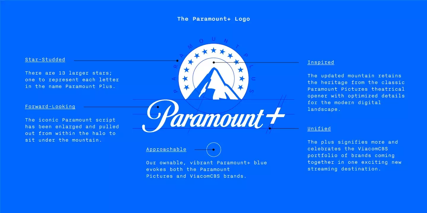
Meanwhile, the company said that when making the logo for Paramount Plus, the 'number of stars was reduced to 13 — a star for each letter used when spelling Paramount Plus'.
Advert

The stars also had to be made bigger to be more visible on phone screens, with the release of their streaming service in 2021.
Tammy Henault, SVP of consumer marketing for ViacomCBS Digital, said: "The goal was to ensure we would still have that recognition and the benefits and equity of the legacy Paramount brand but update it so it can stand on its own to represent the new service.
"It was important that the new logo be reductive enough to work across digital platforms and applications to carry the Paramount identity forward into the streaming space."
Advert
Of the newer logo, Sarah LaBrache, who serves as the SVP of creative marketing for Viacom CBS Digital, said: "We created a shadow that holds true to that original Paramount heritage, and that also reads clearly at various sizes across all applications."
Topics: Film, TV and Film, Entertainment