The Starbucks logo is arguably one of the most recognisable across the world, but we bet you've never thought too much about the story behind it or what it really means.
Turns out, it actually has a bit of a disturbing backstory.
Over on the Starbucks website, the coffee chain has dedicated a section to the 'evolution of its logo' where it explains how it originated over 50 years ago.

Advert
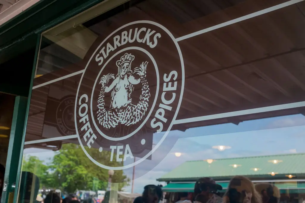
The original logo for the Seattle-based brand was created back in 1971 by artist Terry Heckler.
It depicts a 'bare-breasted siren' with a twin tail and some rather dark origins.
"Terry and our founders had given the company a name, but they needed an icon to go with it," Starbucks wrote. "Terry scoured old marine books until an illustration caught his eye – it depicted a siren, a seductive twin-tailed mermaid from Greek mythology who enticed passing sailors to their doom with her enchanting song."
Zack D. Films, who creates informative simulation videos of world events over on his YouTube channel, shared a video explaining how the once 'creepy' logo has transformed over the years.

"You might assume that they chose the siren because it looked like a mermaid in the sea, but there's actually a deeper and darker reason behind their decision," Zack explains.
"The Siren has its own history that's sort of troubling and the original founders knew this.
"...The characteristics of the siren remained consistent - they were seductive and violent. They used their beauty to seduce sailors to come with them in the water... They would literally jump into the water and to their deaths."
So, what exactly has this got to do with coffee?
Well, Zack claims that the very first logo - in which the Siren is bare-breasted and with her tail 'wide open' - was 'no accident'.
"The owners expected people to see Starbucks, smell Starbucks and desire Starbucks, just like the sailors couldn't deny the seductions of the sirens, the founders of Starbucks wanted to make you unable to resist their coffee," he explained.
"This isn't speculation. Former chairman and CEO, Howard Schultz wrote 'that early siren, bare-breasted and Rubenesque was supposed to be as seductive as coffee itself'."
Zack claims that over the following years, the brand adapted the logo to make it more appropriate, with it's current logo being the 'tamest' version yet. Despite the variation over the years, the siren has always been 'the focal point' of the Starbucks brand.
Topics: Food And Drink, News, US News, Starbucks
